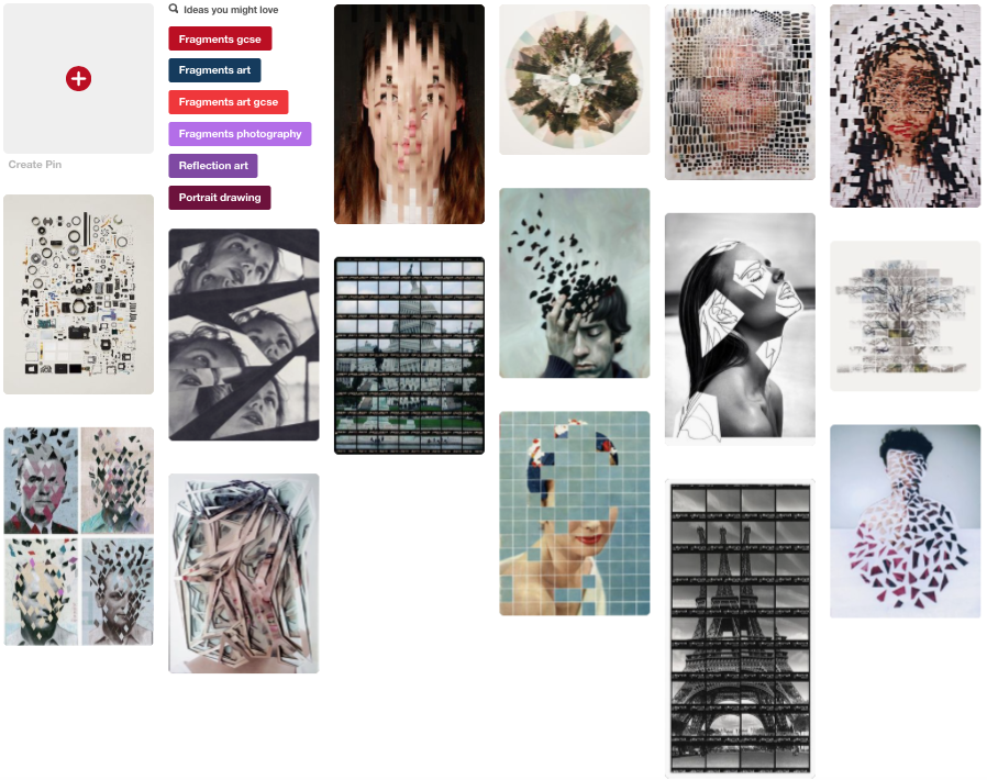
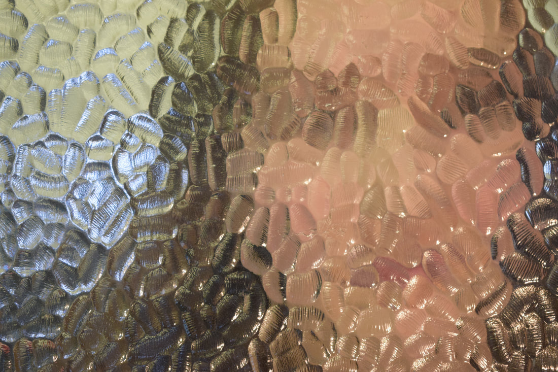
pinterest board
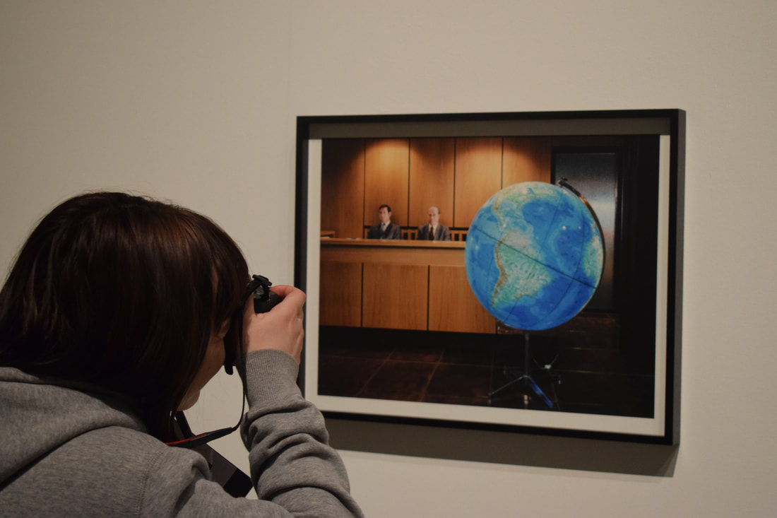
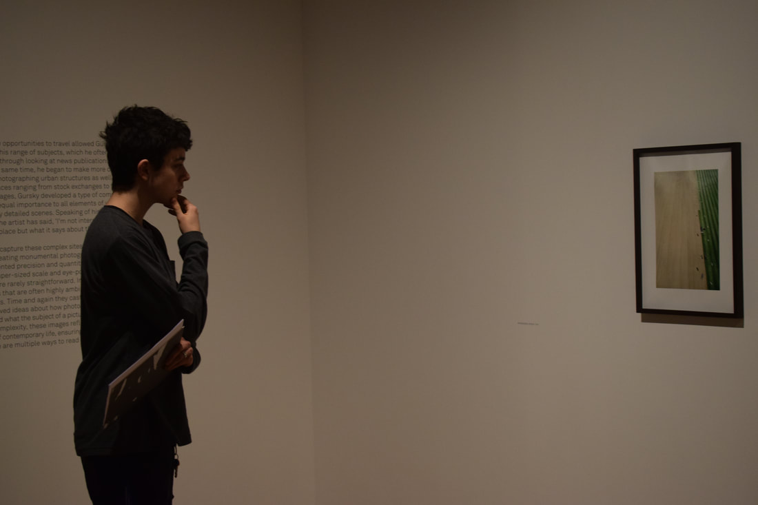
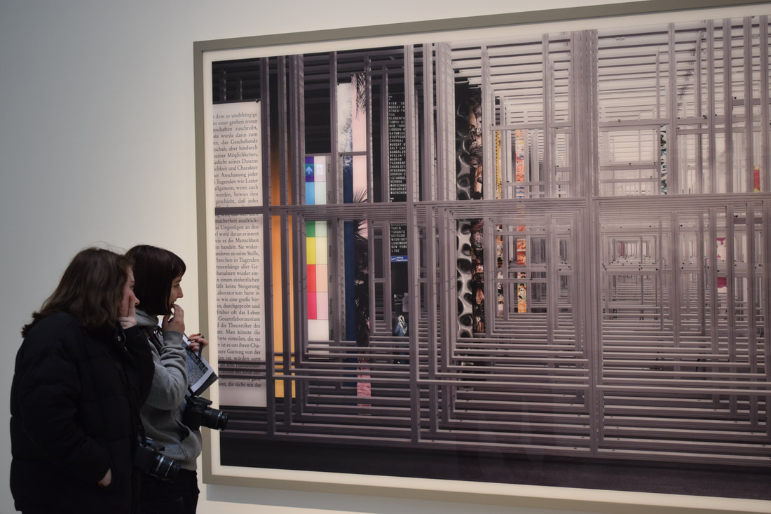
gallery visit: andreas gursky
Andreas Gurksy is a German photography, born in Leipzig in January 1955. He has a unique style of contemporary photography which has helped him establish himself as a prominent figure in the photography and art industry. Many of Gursky's photos show wide open spaces, and are taken from an elevated or far-out view; it is this style which become so recognisable to others. In January, we went to visit the Hayward Gallery, where Gursky was having an exhibition - his first in London since 2007 and only his third here overall. Below are some of my favourite photos by the photographer, and some within the gallery while we were there.


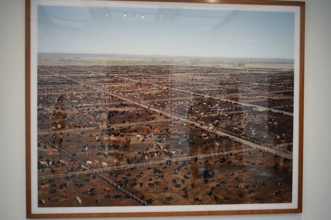
Photo one: This presents the differences between the modern and old era, with the hills of Southern France contrasting to the endless rows of solar panels which stretch into the distance. Despite the large prints sizes used by the artist, each individual line is clearly visible; this intricacy is something which is a regular occurrence in Gursky's photos. The fact that the modern representation is layered over the top of the 'old world' representation implies that it is taking over; that it is nearly 100% covered also shows the extent of this.
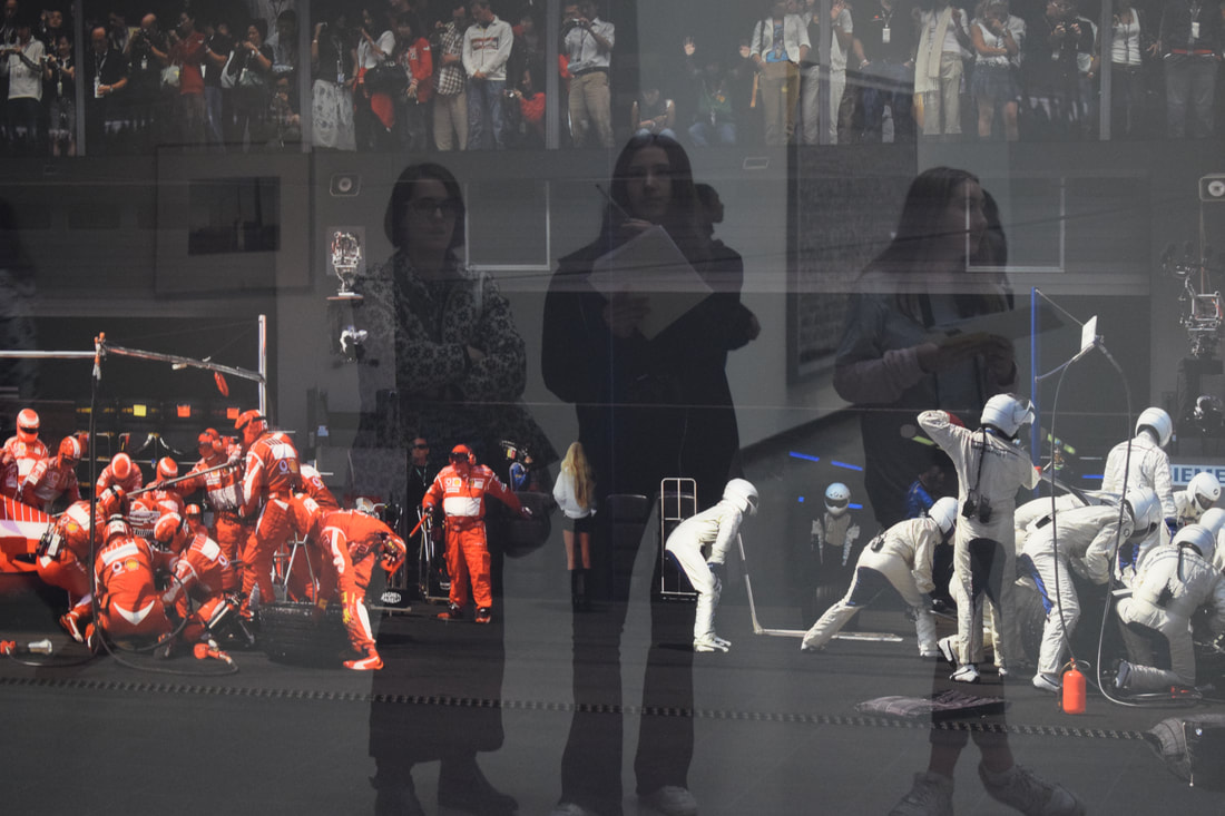
Photo two: This photo in particular is one of my favourites, especially as although it is clear this would not happen, it looks extremely realistic and almost as though it is unedited, such is the artist's expertise. The sheer numbers crowding around the vehicles successfully present the havoc and rush of a pit-stop, such is the manner of a real-life F1 race. The bright red and white initially stand out against the dark, therefore at first disguising the spectators at the top, and what they are doing. It is another aspect which is intriguing and makes the photo so good, with the cheering crowd allowing you to believe it is real. |

In this image, Gursky has managed to achieve a sense of chaos and disorganisation, which so often are features in airports, by compiling together the dense, ever-changing lists of places and times. As the viewer has so much to look at all at once, it is hard to focus on a specific point especially with the majority of the photo in black and white. The repetition of words and numbers exacerbates this, creating an excellent end product.
|
|
|
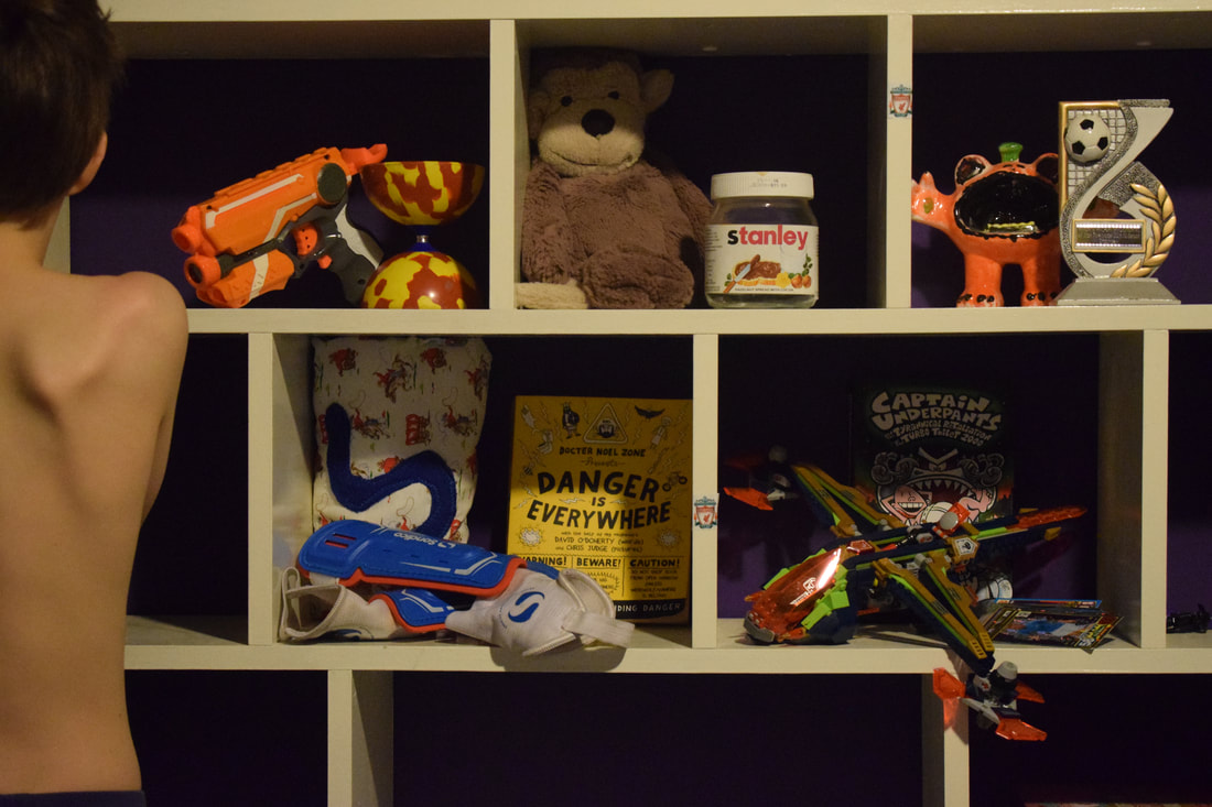
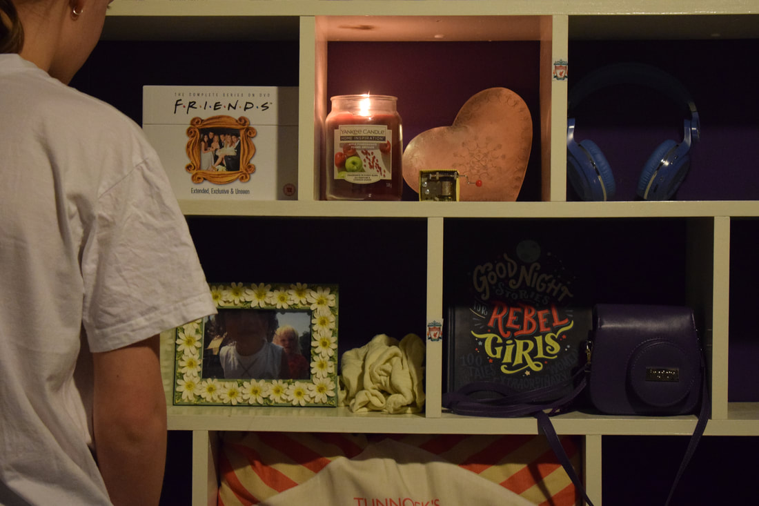
fragments of a city
|
|
|
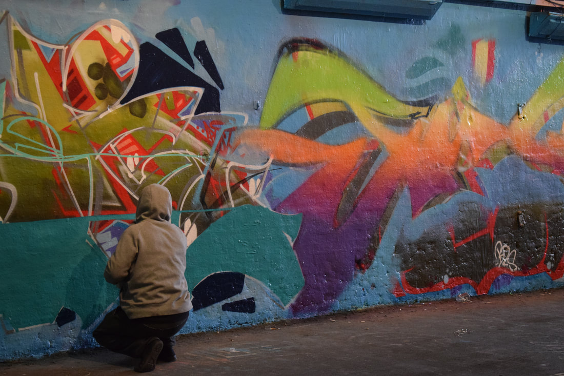
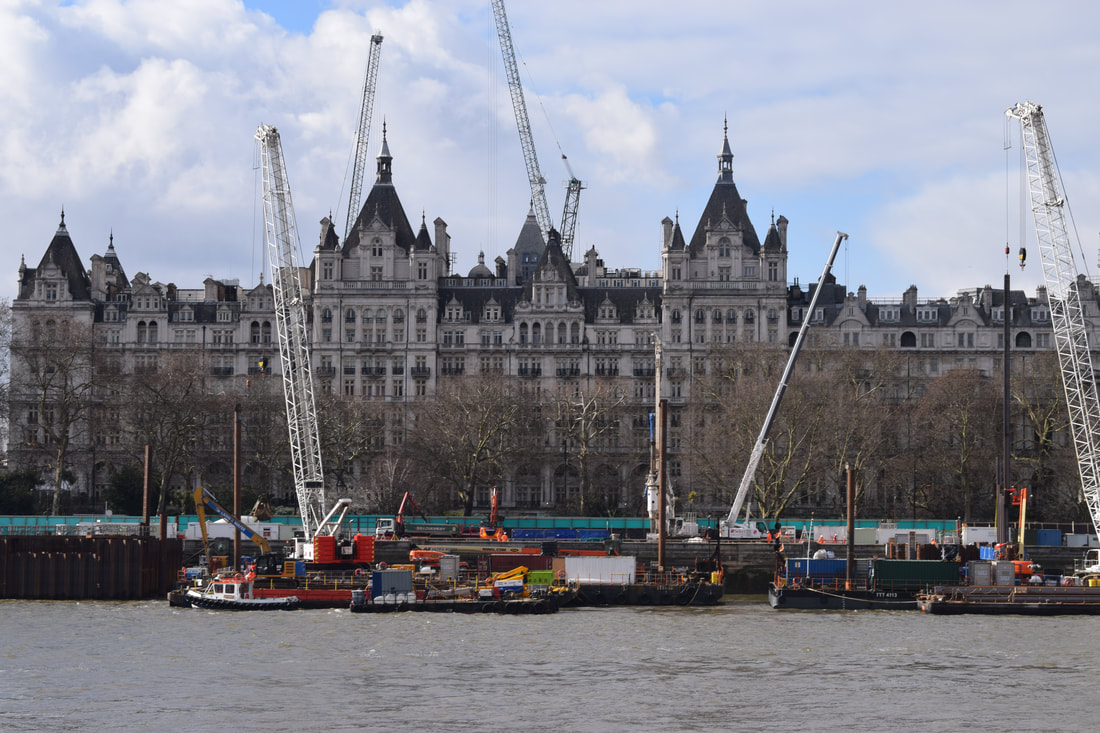
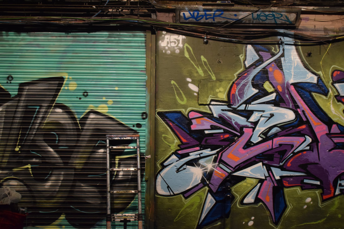
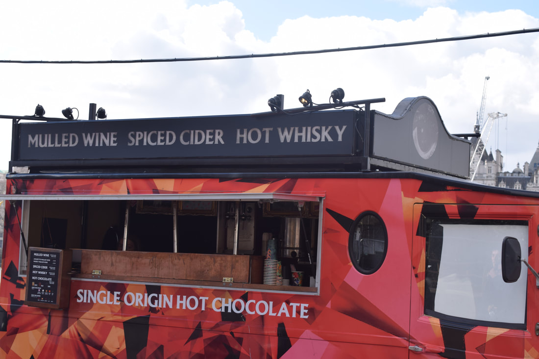
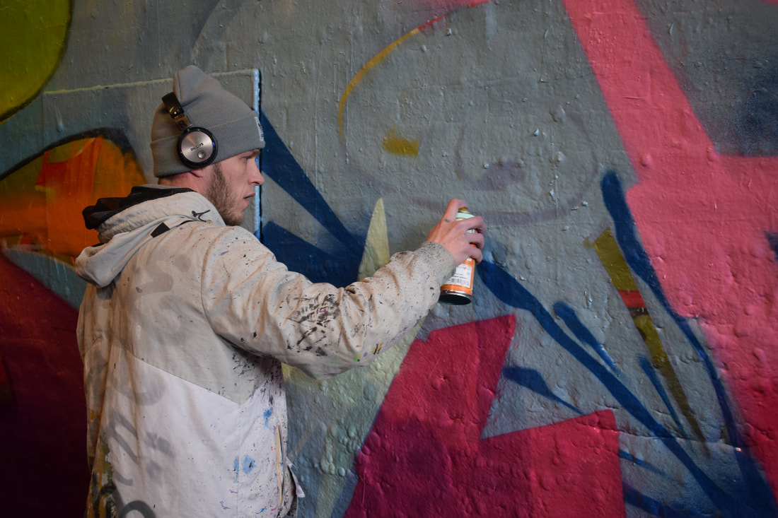
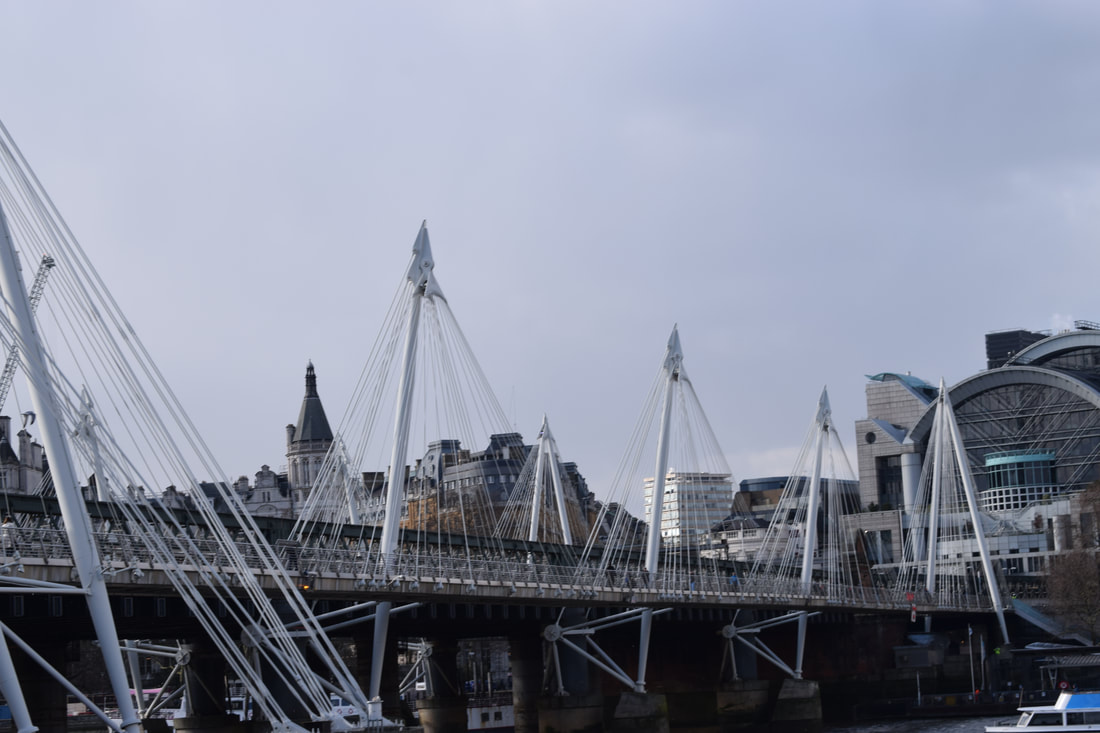
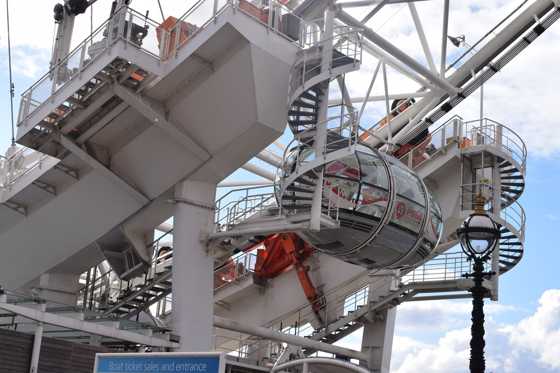
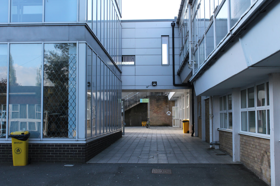
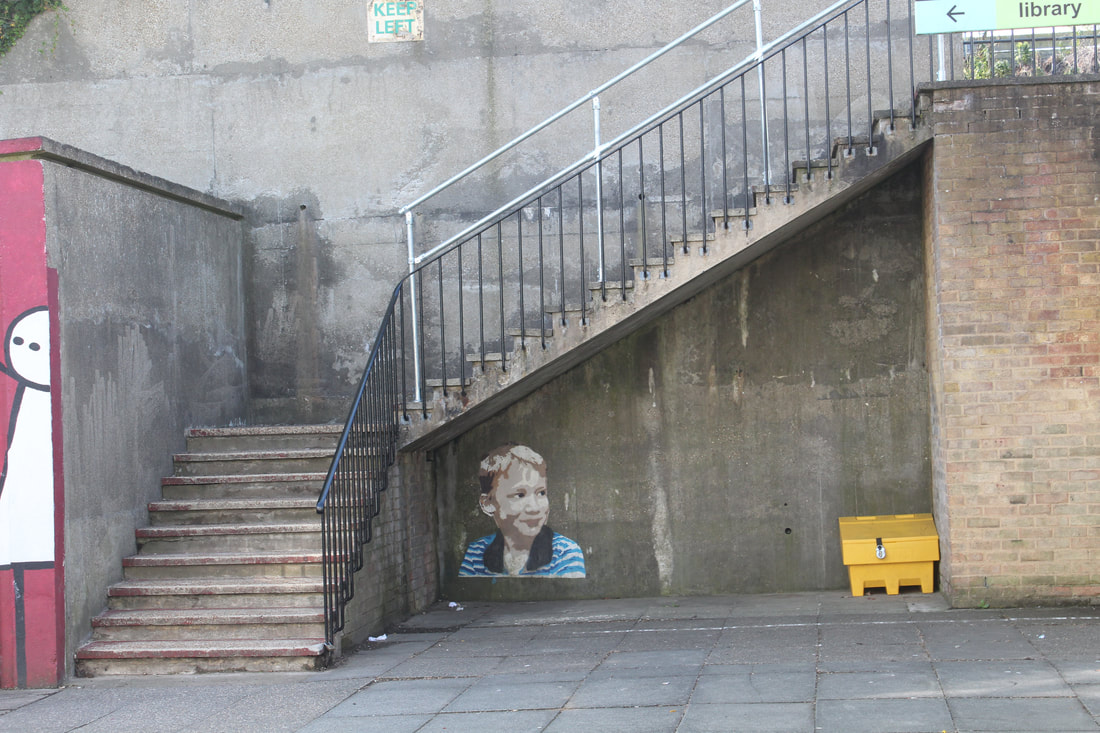
During our visit to the Hayward Gallery, we also travelled around South Bank, where we captured some images of the area, representing 'fragments of [the] city' - images (4) to (9). We then went to a tunnel that was covered in graffiti which was my favourite part of our route following the Gallery; these can be seen in images (1) to (3). These are also my favourite images, as they represent an area of London which is not in full view and will often go unnoticed, rather than the other photos which can easily be seen by walking along the bank of the Thames. As seen elsewhere, much of London is made up of greys and dull colours, which contrast strongly with the colourful graffitied tunnel. People, like those in (1) and (3), have decorated somewhere that was previously among those places of dull colours but has gone on to become something else. By having people within the photo it makes it seem more like fragments from a city, as cities, namely London, are not devoid of people. Personally, I did not like this specific topic as much as others as I struggled to decide on what to photograph and as a result my final pictures did not come out exactly as I would like them. Images like (7), (8) and (9) show large portions of the city rather than individual fragments, although I saw the entire 'graffiti tunnel area' as a fragment on its own - it is the close-up element of it, for example image (3), which makes it more suitable to this title. Overall, I believe towards the beginning I understood the idea of fragments less, and instead rather photographed whole areas. Towards the end, I managed to understand it further and my photos gradually improved over the time.
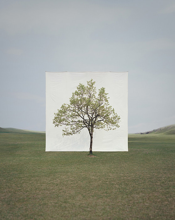
myoung ho lee: fragments of nature
Myoung Ho Lee is a young South Korean photographer who bases his portraits on four procedures: 1) selecting a subject and 2) separating the subject, then 3) photographing the subject, followed by what he calls 4) 'confirmation of the separation'.
|

|

|
Ho Lee's images successfully portray his 'subjects' as the centrepiece, though more so in (1) and (2) than in (3). The basic green backgrounds and (relatively) clear skies in the first two place all focus on the trees, with the white background effective in framing them. Despite being edited on, the white sheets look as though they are really there, due to key details such as shadows, blades of grass and the creases in the top which imply they're being held up. Image (3) as a whole is not as good as the other two, as other trees divert attention and the whole image is the same colour as the subject, which is also hard to see because it is so sparse.
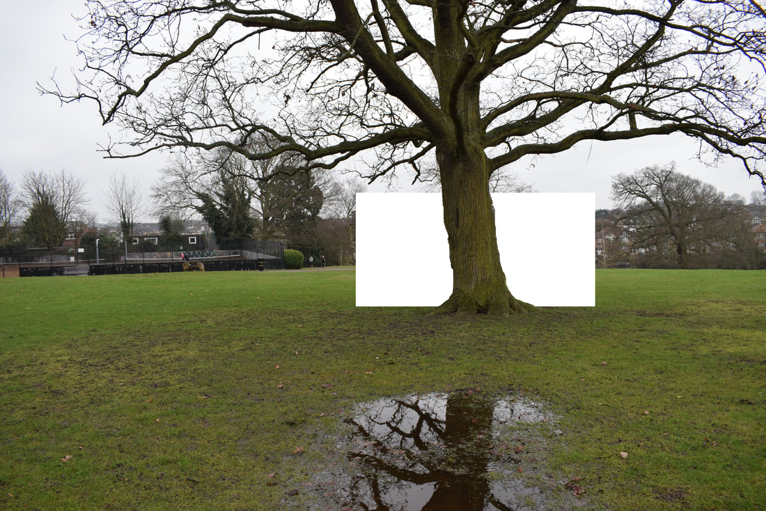
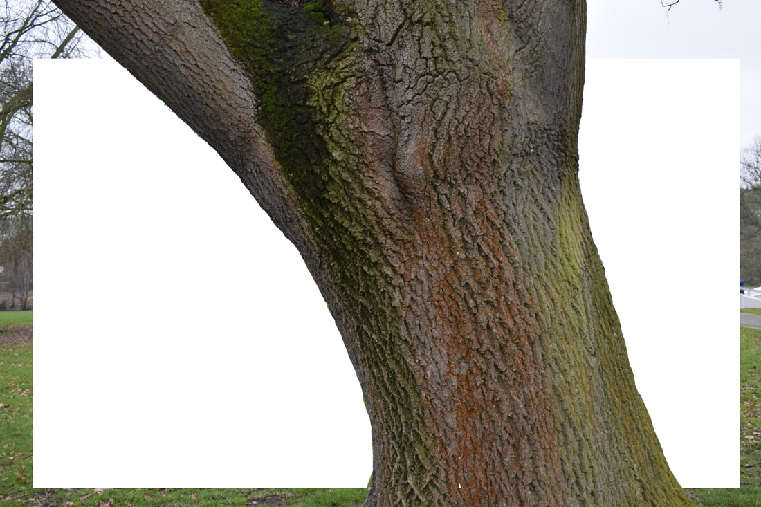
my response
|
|
The use of Photoshop has acted as a disadvantage in these images, as though in image (2) it works to frame the trunk, the thin branches in (1) that meant that the white rectangle was only inserted behind the tree mean attention is drawn away from the tree. The bright white in comparison to the greys of the sky also mean, in image (1), the focus
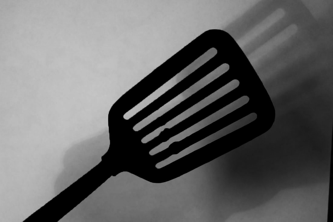
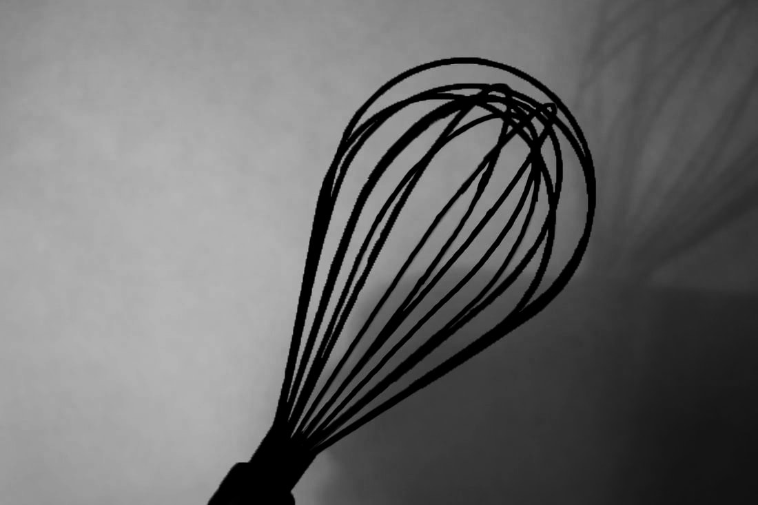
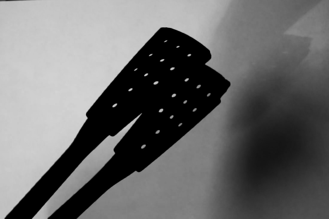
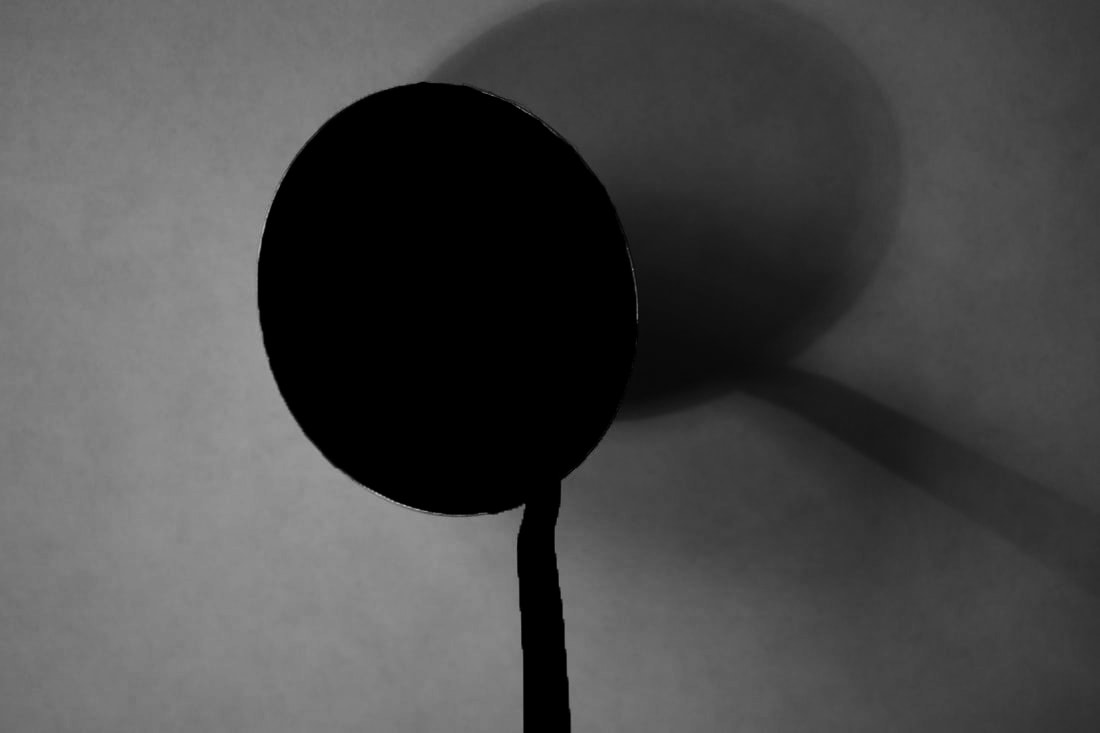
dan tobin smith: fragments of objects
Dan Tobin Smith is a professional fashion photographer based in London who has worked for companies including Nike, Absolut and Louis Vuitton. The photos exhibited below are examples of his series of photos for 'Skin Issue Exhibition Magazine'
|
|
|
first response
|

|

|
second response
|
|
|
frankie irvin: fragments of people

|

|

|
my response
|
|
fragmented portraits

|
|
|
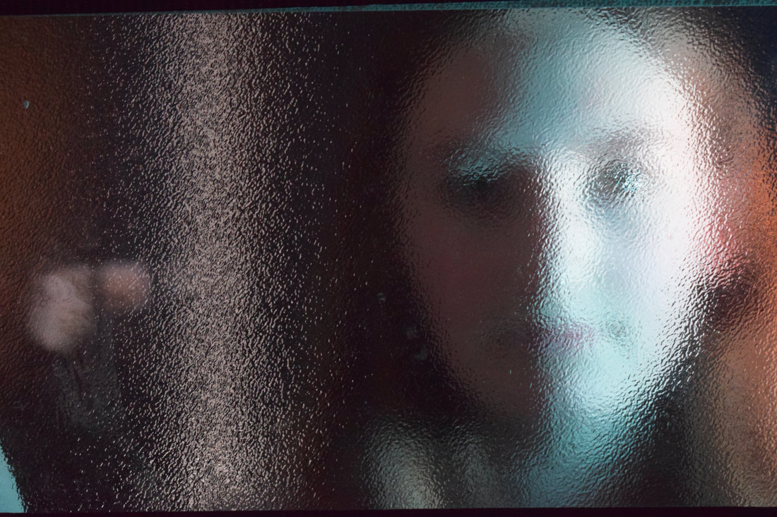
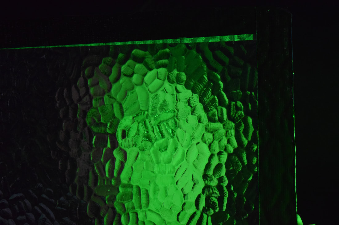
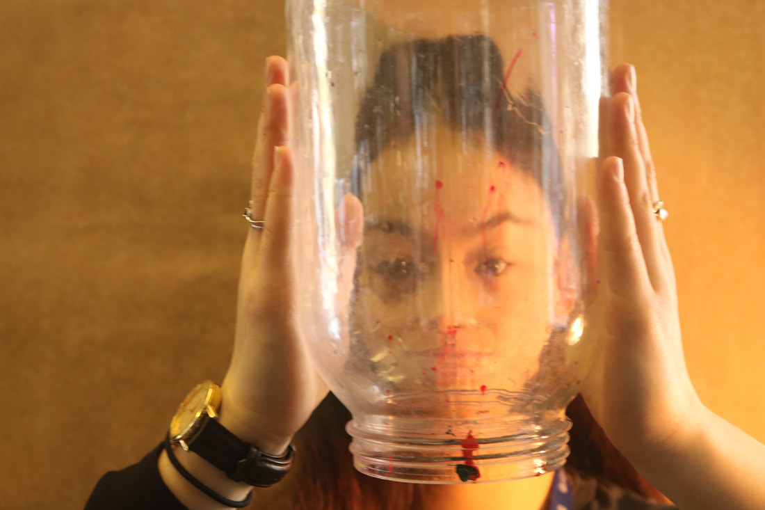
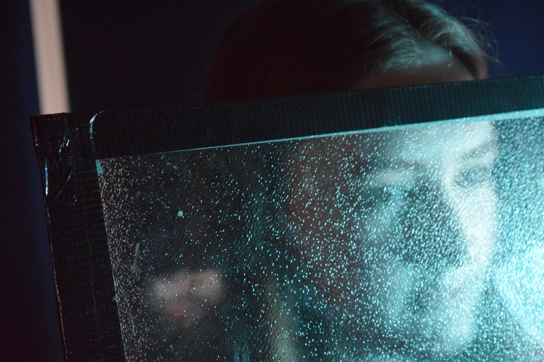
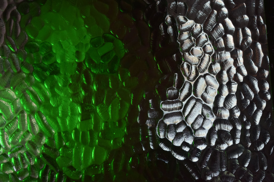
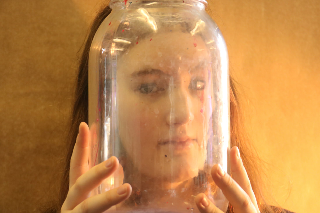
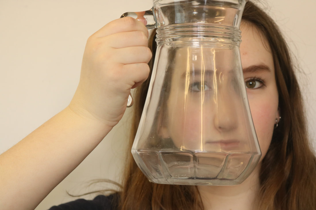
In my opinion, while some of these photos were effective, others came out without my intended final product. Despite this, I used a range of styles to show the differences between the styles and which came out the best. For example, while I personally prefer the images with the jars, images (2) and (3) use a dark background and the paint on the jars makes them look a lot worse than how they could potentially be. Image (9) uses a clear white background and a clean jar, so while the reflections and distortions in (2) and (3) worked very well, (9) comes out the best because the photo looks is easy to look at and has a clear contrast. (4) and (5) are not final products, but rather the process to reaching (1) and (8). We created the coloured effect by projecting light onto the glass and it had interesting effect, where it only seemed to shine on the model's face rather than the rest of the screen. This was least clear in (1), as a few shadows on the silhouette are light shades of blue, but the entire thing is majority the same colour as without light. In contrast, blue lights are shone across the whole screen in image (5). This was clearest in image (8), where the area surrounding the the face behind the glass is completely black, and their face is a vibrant green colour. (6) uses the same glass screen without light, where there is an entirely different effect and each feature and colour that makes up the person's face is visible. I believe the least effective of the nine is image (7); this was made using a vaseline-coated glass sheet. Though it distorts and shapes the features slightly, it does not compare to the successful job done by the other photos compiled together.
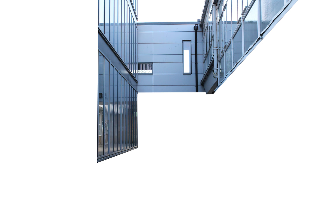
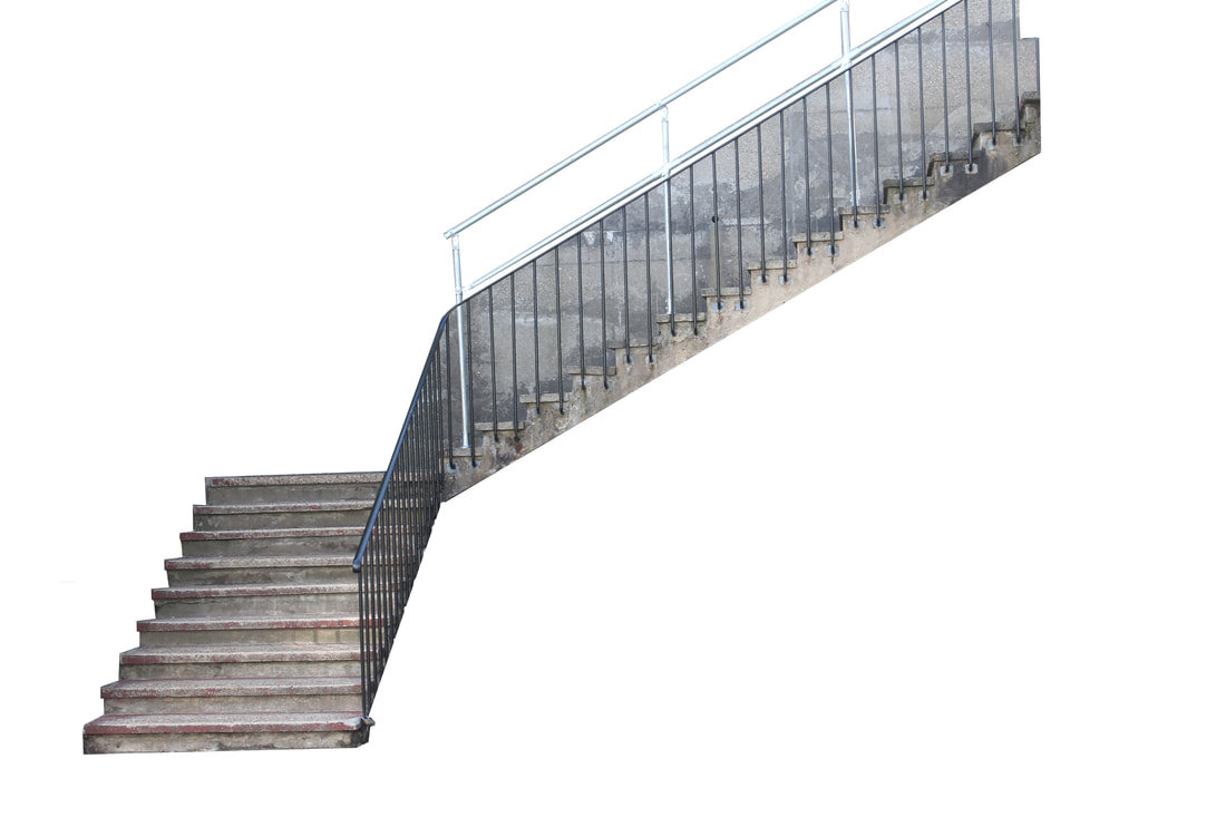
patrick cornillet: fragments of buildings
Patrick Cornillet is a French artist and photographer, born 1968, with his recent work (pictured below) showing basic constructions in empty spaces; this is only a small area of his work: most of his time is spent as an artist rather than the photography industry.

|

|

|
Most of Cornillet's work has been done using straight and direct lines, rather than the real arcs and trajectories of the architectural photos. This is done differently in each photo, but can be seen best in image (3), that contains jagged and uneven corners at each point. (1) also uses straight lines, but has very few twists and turns in a simple outline. Contradicting these is the second, which uses vaguely curved lines but overall is a simple structure. Cornillet has captured the way in which most examples of architecture are of a basic and dull design; this is further reinstated with the placid grey colour scheme used, albeit against the artist's white.
my response
|
|
These images were not extremely difficult to make, with the simple use of a polygonal lasso leading to a simple outcome. While I like the simplicity of these photos, they are not remarkably exciting structures and I believe a better and more interesting location could be found to create a better result, were I to photograph outside school. In image (2), the inside of the top of the handrail has been outlined, but the railings have not; this works in symphony with Cornillet's work, as in his third image some windows on the building have been traced and others not. I like this effect as the extra tracing may have taken too much away from the image.
how to: fragments of buildings
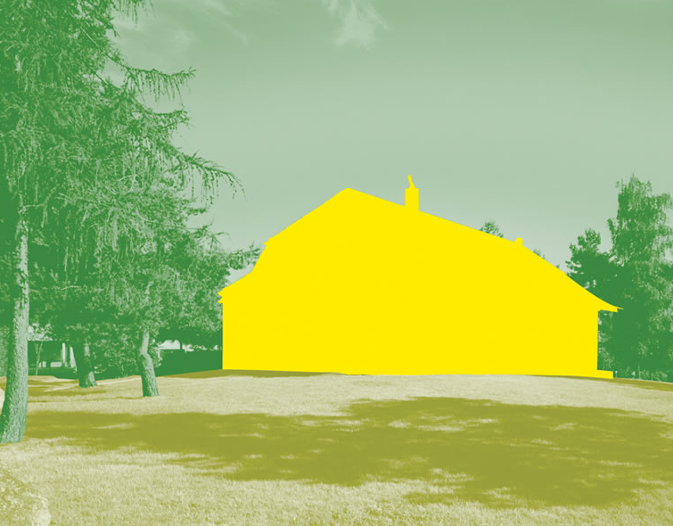
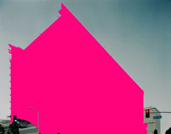
first strand: maureen brodbeck
Maureen Brodbeck is a Swiss photographer born in Geneva in 1974, where she still lives and works. Shown below is her project 'urbanscape and cityscape', where she photographed buildings in LA (where she was living) and Geneva (where she grew up).
|

|
|
my response
|
|
|
|
|
|
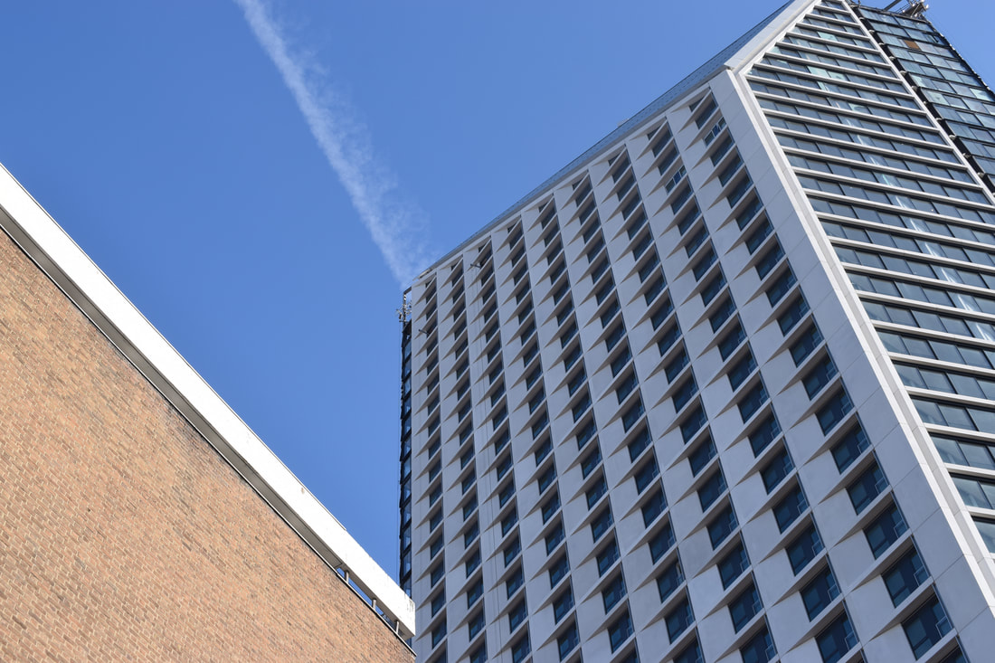
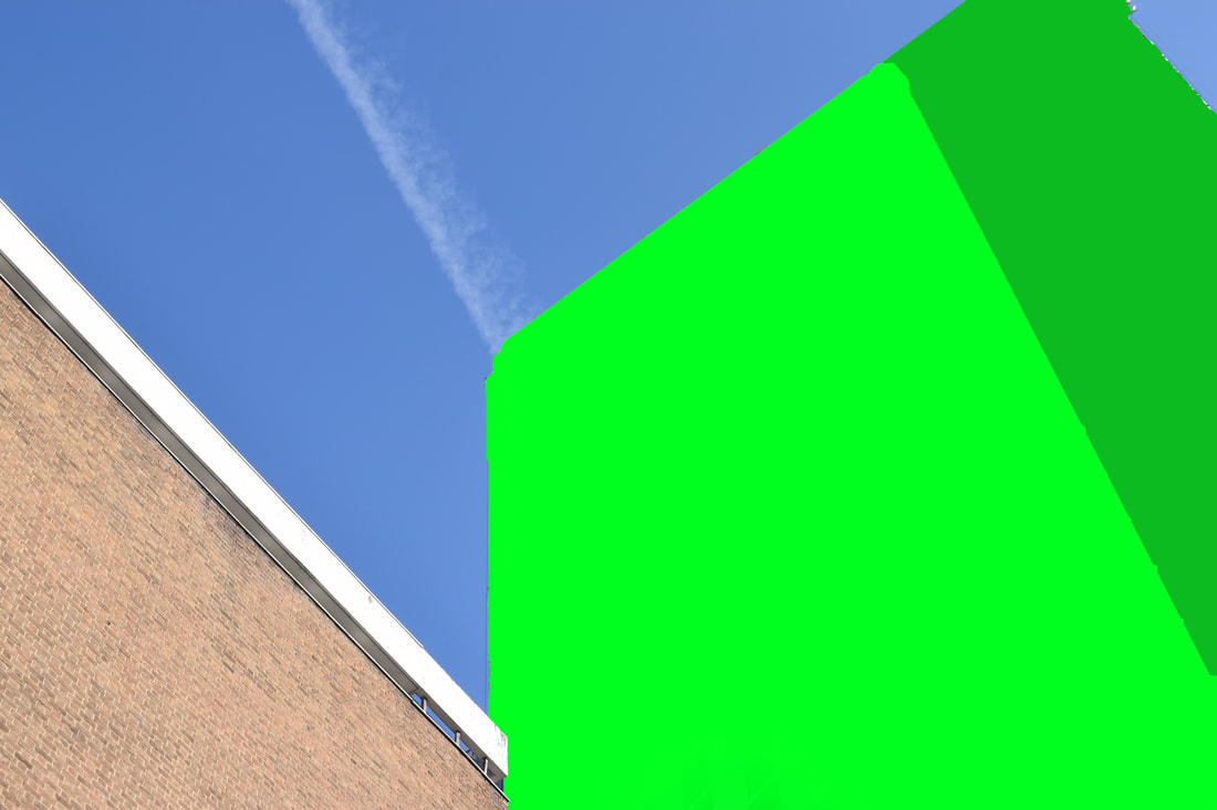
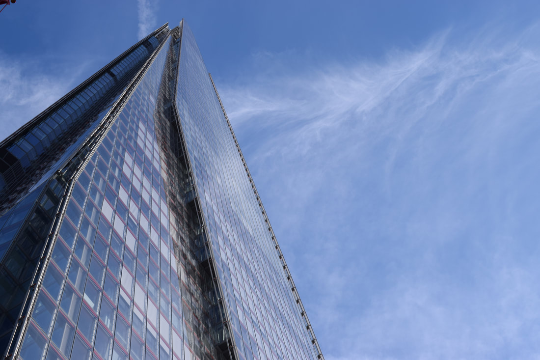
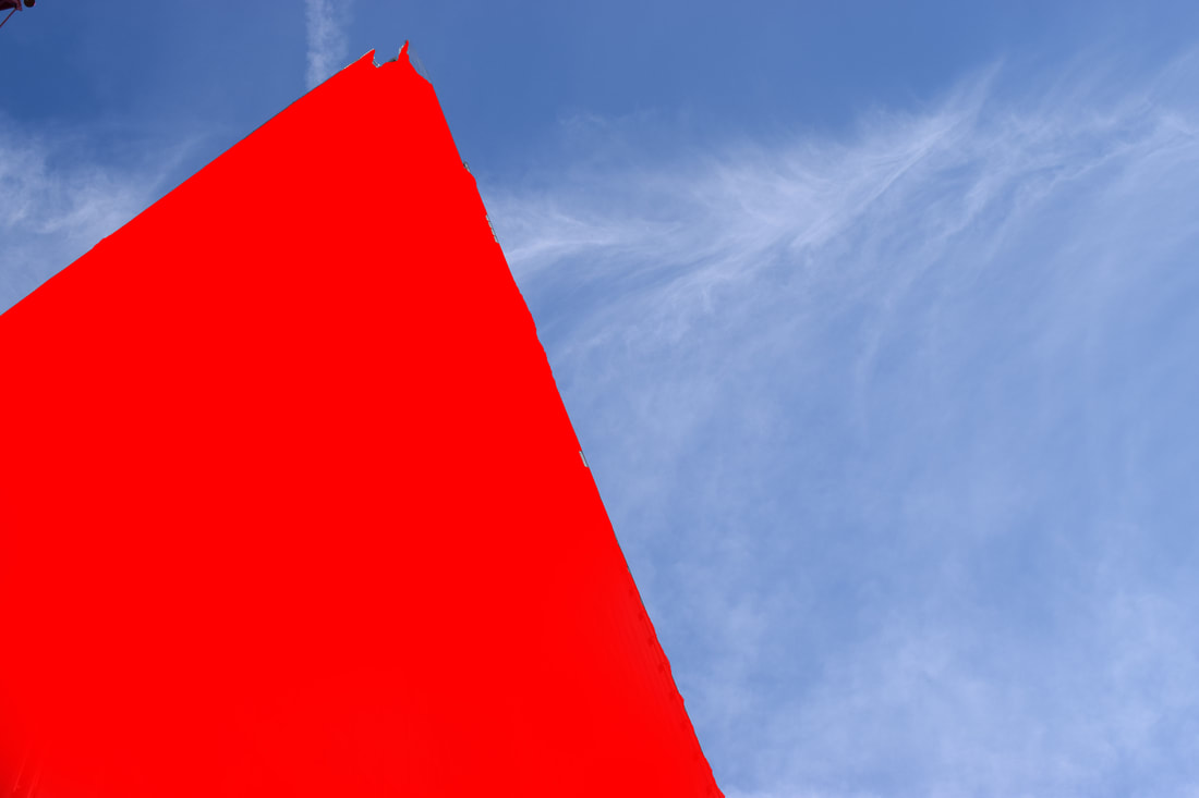
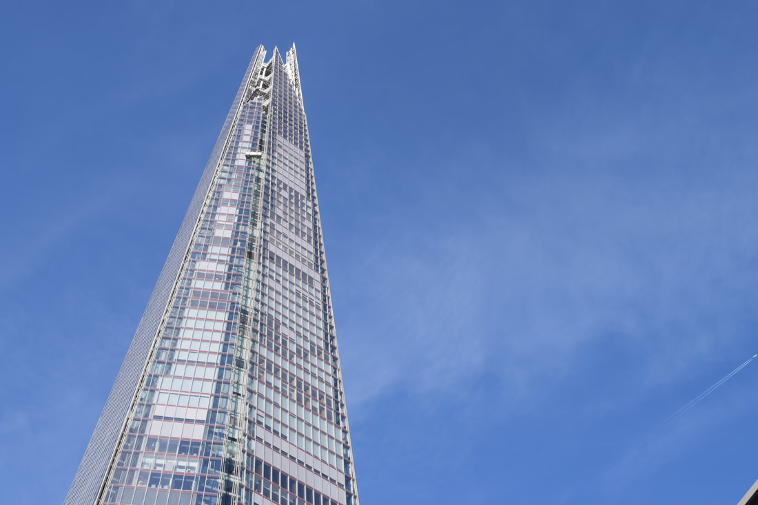
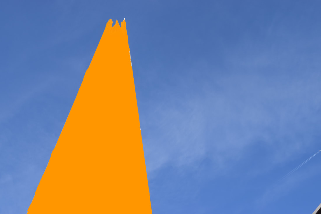
The simplicity of these photos, notably the bold block colour against the clear background is what makes these photos commendable - this is best shown in images (2) and (3). Image (1) is similar to the other two, bar the second large building alongside the main one. This could also be perceived as not a problem being as the second building is a simple structure of a brick wall and keeps the idea of a simplistic and basic concept. A negative to (2) and (3) is that what is intentionally a clear sky behind the building is ruined by small areas of buildings in the top-left and bottom-right respectively. Despite this, the finished product of this worked exactly how I would have wanted it to, and despite basic building formations the details can be seen at the top of the Shard in (2) and (3), and in the colour change from dark to light green in (1), showing where the side of the building is located. The transition between the two colours also works well, rather than an uneven line which would make the picture look poor. Also, despite the background showing a clear, bright day, instead of a completely clear blue sky devoid of clouds, there are streaks and clusters of white, most visible in image (2), but also with a different aspect in image (1). This is important, as it demonstrates that it is only the foreground which is photoshopped - this could be less apparent were it to be a singular block colour against a singular block colour. The photo I personally like best is number (3), which best presents the building (the Shard), but despite this, all the photos came out successfully; indeed, I prefer my own set of photos to those done by the original artist Maureen Brodbeck.
second strand: marcus lyon
Marcus Lyon is a British photographer, born in 1965. His works and publications are held in both private and international collections including the Smithsonian Institution, the Art Institute of Chicago and the Arts Council of Great Britain.
|
|
my response
|
|
|
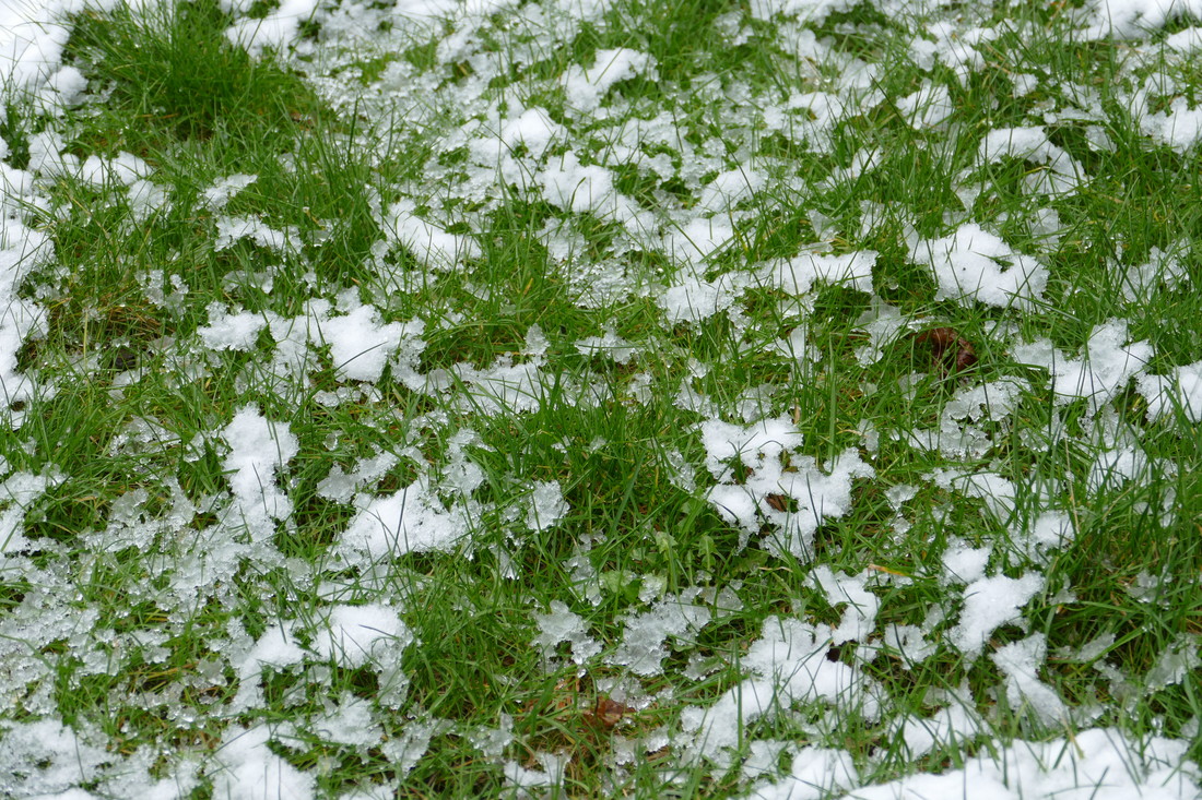
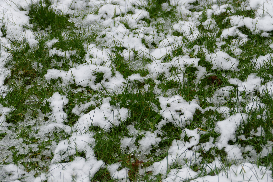
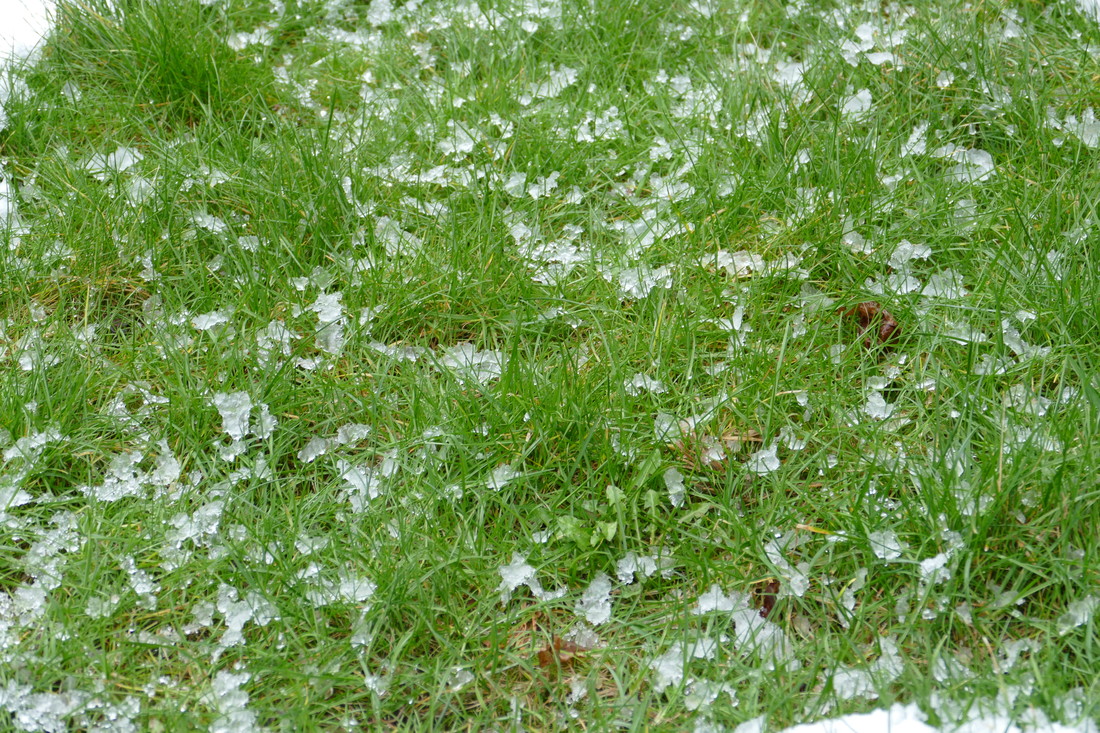
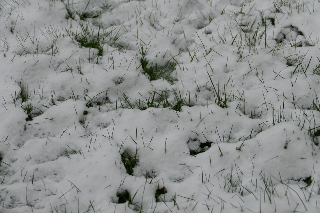
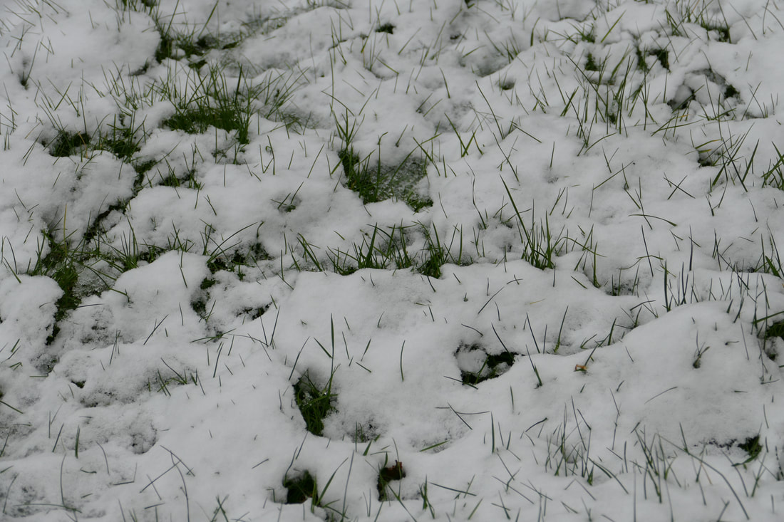
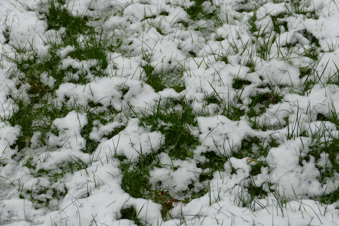
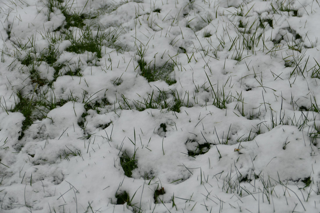
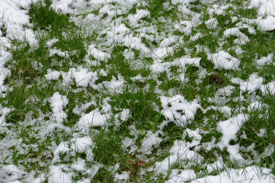
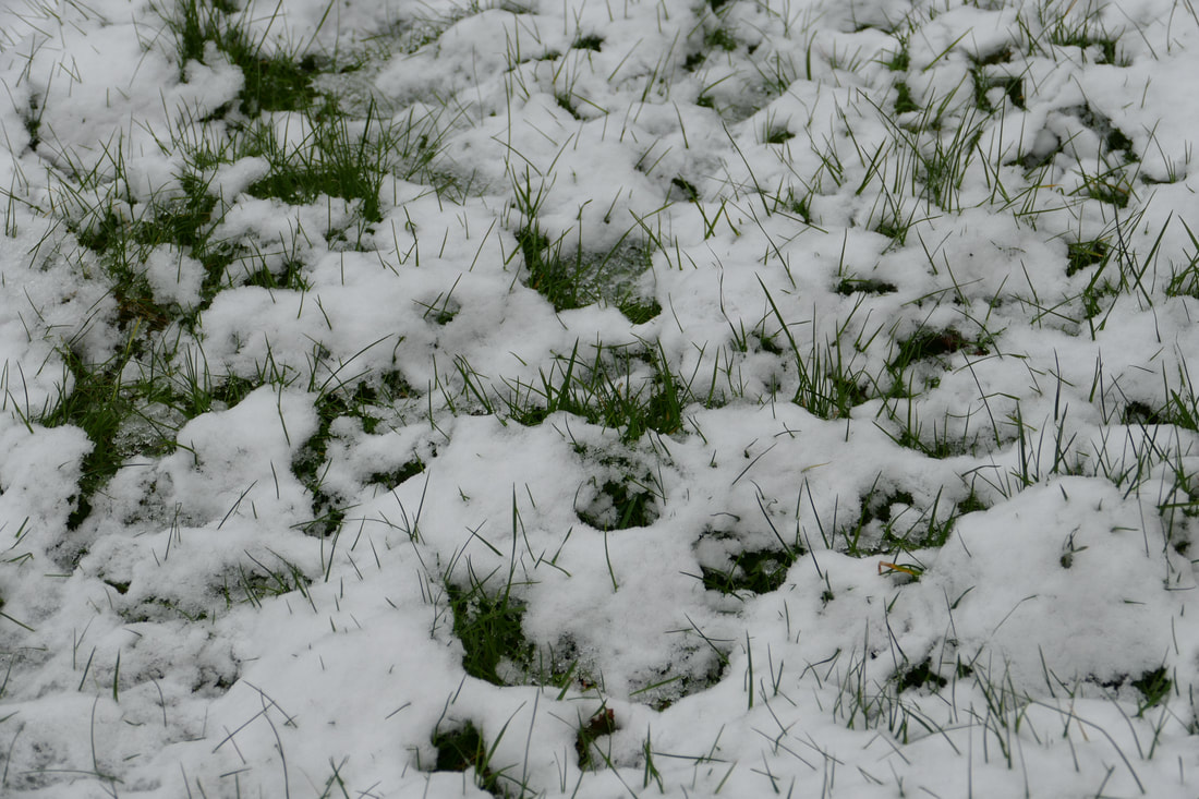
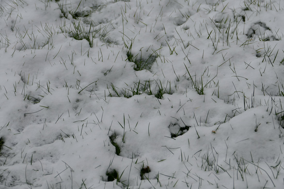
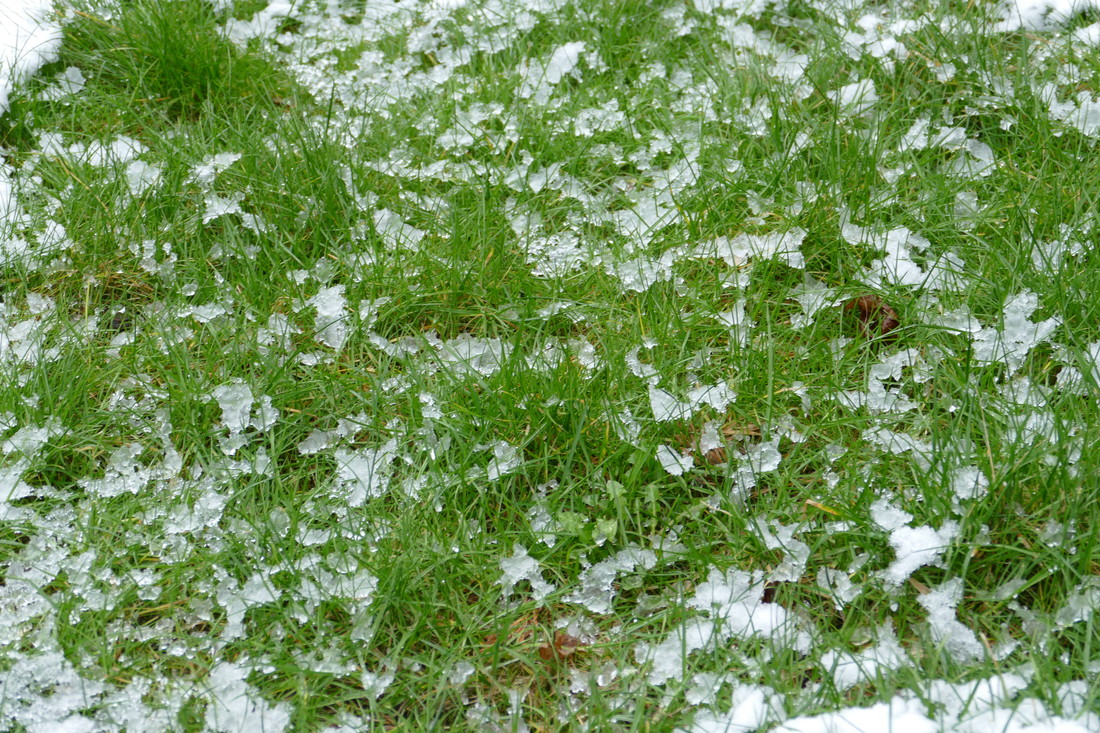
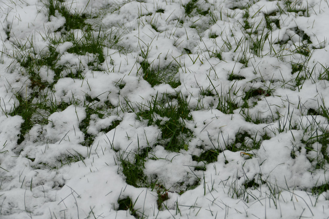
As Lyon's format showed a progression of nature over time, I decided to take advantage of the snowy weather and show a development of it melting. Instead of keeping the photos arranged in the correct order in a progressive timeline, I chose to compile them in a random arrangement (the actual order is as follows: (6), (10), (2), (8), (3), (12), (5), (4), (11), (1), (9), (7)). Instead of waiting for the snow to melt, I used a hairdryer as so to finish it faster, though I was forced to measure the spacing of the heat so that they looked realistic. In my opinion I did this relatively well, though it would have been more improved were the snow to have melted naturally; this is an unrealistic expectation due to the time period. Between each photo there is a clear change, rather than small and gradual changes; this is seen best when comparing photos two apart from one another. For example, there is clear change between (12) and (4), as well as images such as (1) and (7). As the snow begins to the grass also gradually gets lighter, and goes from a dark shade of green to a much lighter tone. Images (7) and (9) specifically are clearly brighter than the others, which makes them stand out more, especially due to the lack of snow in the photos. One drawback I found only after beginning to shoot the photos was the grass had not been cleared, so it was not a clear combination of only the green of the grass and the white of the snow; instead, there were patches of brown distinctly visible, notably in the later images where the snow had cleared (i.e (7) and (9)) . Overall, I am happy with the final product but if I were to replicate this, I would definitely have made some corrections.
third strand: anthony gerace
Anthony Gerace lives and works in London; his photographs typically combine three elements: collage, photographs and typography. This can also be seen below in a few of his many pictures, designed in a similar style and technique than his others.

|

|

|
my response
|

The difficulty of this task was cutting around the subjects initially and leaving no white areas, specifically around the hair (in the second picture it can be seen around the top). This problem was solved, though, by filling in the squares in which the areas were most prominent. Rather than cover the majority of the face, as Gerace did, the squares are scattered across the face in a random assortment, though there are much fewer as the intention was not to obscure the face completely. This can be seen as none of the key features are covered, and the actual faces are still visible. A further difference is the obvious grid lines on my photos, which tell you of the use of Photoshop and editing, in contrast to Gerace's images which look more man-made, and the editing element is more obscure.
|
how to: AG response
strand development one


|

In this set of images I used same placements of the squares as in my third strand, as the structure of the piece has not changed by a significant amount, but used all three block colours in various arrangements. In my opinion, the best of the three is the diagonal strips, as the scattered arrangement of colours feels random and disorganised, rather than the simple structures of images (1) and (2). These images feel not dissimilar to the original photos, while image (3) seems to be more of a development. Despite this, I think the basic idea has been achieved, and that it is a suitable end product. The key issue is the fact that while it is a development from the previous strand, it has not progressed as much as, for example, this development to the second (below).
|
strand development two

|
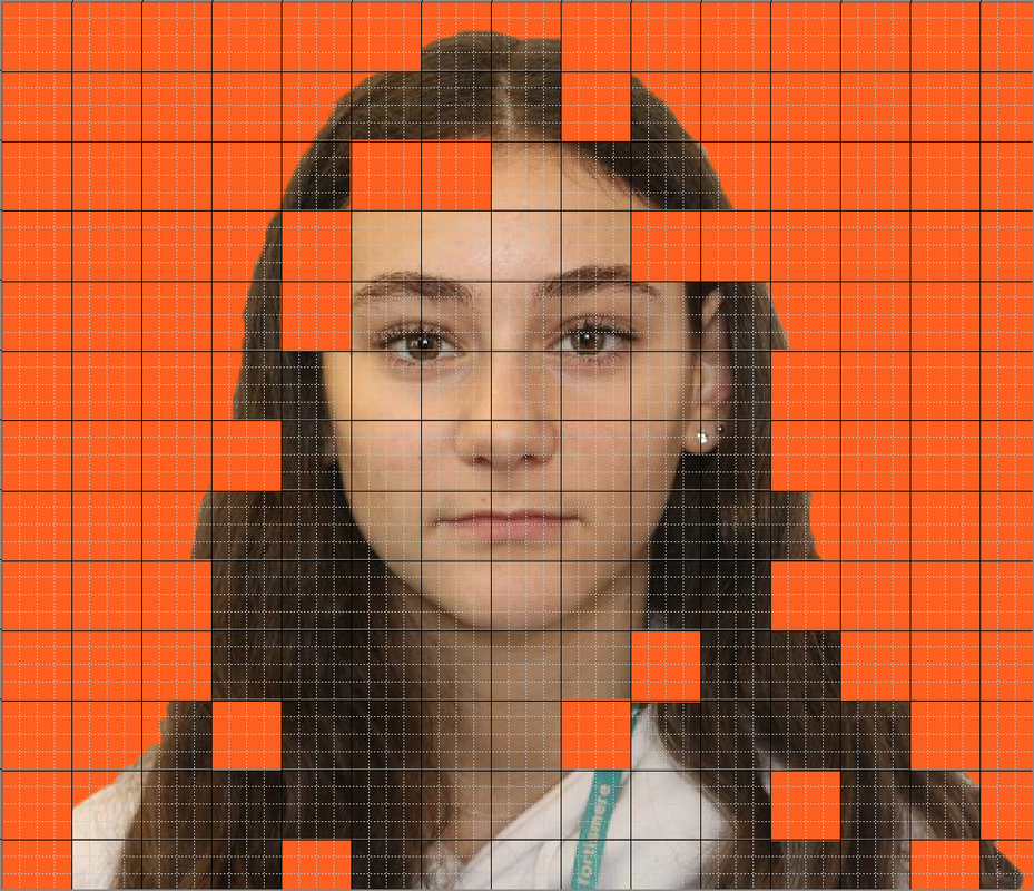
By only pixelating the face of the person in the picture, the focus is put on them, rather than if the entire image was pixelated. Each individual pixel also has a different colour, really defining the shadows and brighter areas of the face, especially because of the small size of the pixels. This can be seen best in areas such as around the mouth (which show that expressions, i.e. he is smiling), and under and around the eyes, nose and chin (which generally make it seem more realistic, as it creates a more 3D effect and defines the features which make it so easy to observe who it is). One downside to this photo is the background, which should be a basic colour such as white, but is instead various colours, as well as a door handle, which disrupts the viewer's focus from the main subject in the centre.
|
final piece
|
|
|
|
|
|
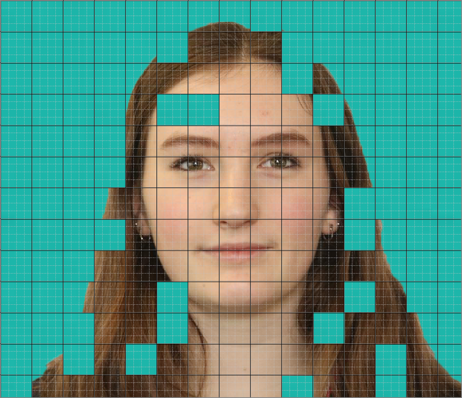
The length of time used to make my second development led to the design of my final piece, as well as other factors such as how I felt the hat and door handle diminished the quality of the image. Another reason is, by zooming in, you are further able to observe the varying colours across each individual square alongside each other. In much darker and lighter areas, such as the cheeks, it is not so obvious, but when zoom is applied, the intricate detail can be acknowledged and appreciated. Among the four photos I used photographs based in different locations, and of different people to give a variety; for example, images (2) and (3) look remarkably similar because of how the lighting looked at that site, while (1) and (4) are evidently taken from other places. This is one downfall of the quartet, as the expressions, skin tone and lighting make two of the images look remarkably alike, instead of all the images or none of them resembling significant similarities to each other. A further reason why framing only this area would be beneficial is that the face is the key part of the image, and by pixelating other, less relevant areas, the clarity of the intention of the photo diminishes - to show how defining features can help to identify a person, even when they are obscured. For example, it is apparent that image (1) is a younger child in comparison to the others. The colours in the photo are also symbolic, as the brighter colours, shown in (1) and (4), are done on the happier expressions, whereas the darker ones on the same skin tones are on those who have more serious expressions. Overall, I am happy with this final project, and believe the positives vastly outweigh the downsides.
